Color Us Happy: It’s a Very Peri New Year
As the countdown from 2021 to 2022 ticked on, our minds were already racing ahead, planning for the new year. We’re excited to see what the next year brings, what trends unfold, and what new technology launches.
Sure, we have no crystal ball. However, we are in the know when it comes to what looks fabulous in your home, how to present it in the most flattering light, and what buyers want from a home.
A pleasant surprise
So, you’ll get a kick out of this. There we were, all eyes on Pantone, desperate to know what the color of 2022 would be. Our Twitter refresh button was wearing down, y’all.
We were feeling confident that they would go for green. Because, not to brag, but we know about this stuff.
I mean, we expected a color symbolizing nature. Something that reminded us of the rolling sea, lush gardens, or glistening jewels, you know? A color that represented the longing to escape the drudgery from our ‘stuck’ lives, dreaming of travel and escape like a beautiful, delicate, trapped bird…
Cough. We’ve said too much. Let’s move right along, shall we?
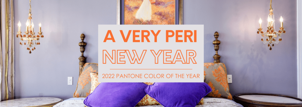
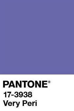
But the thing is, Pantone announced a brand-new color. Read that again. It’s a brand-new color. This year’s color is Very Peri. Boom! And y’all, we did not see this coming!
So, if Pantone, the international color gurus with a sophisticated palette, choose Very Peri as their color, we’re all in.

What color, exactly, is Very Peri?
Now, let’s test your knowledge of colors with a pop quiz. Tell me, what color would you call Very Peri? Purple? Violet? Lilac? A distant cousin, twice removed, of periwinkle blue? Honestly, we don’t truly know what box Very Peri fits in, which might be why it works.
What does Very Peri represent?
Do you remember the post-lockdown Ultimate Grey and Sunny Yellow, chosen for quiet reassurance and resilience in the face of difficult circumstances? Well, it’s a new year: new color.
Very Peri stands for change in the world as we move beyond isolation and uncertainty with the “happiest” and “warmest” of colors. It’s a mix of faithful blue and exciting red.
What we do know is that we echo Pantone’s love of Very Peri’s “spritely, joyous attitude and dynamic presence that encourages courageous creativity and imaginative expressions.” Those are definitely the vibes we are looking for in 2022!
Experts use words to describe Very Peri such as:
Bold.
Daring.
Confident.
Warm.
Comfort.
Carefree.
Beautiful.
Are these the attributes you want your home to share?
The color, Pantone says, “represents what’s happening in our global culture” and the fact that it’s a new color “reflects the global innovation and transformation taking place.”
Pantone gives a nod to the digital/virtual world as they acknowledge the advancement in technology “it illustrates the fusion of modern life and how color trends in the digital world are being manifested in the physical world and vice versa.”
Minds = blown.
Communicate in color
If Very Peri was a feeling, that feeling would be newness. Because there’s a psychology in color. Through color, we connect on an emotional level.
Pantone sums it up: “Society continues to recognize color as a critical form of communication and a way to express and affect ideas and emotions, engage and connect.”
With this in mind, let’s choose interior colors for our home that create a mood, a tone, a vibe. Selling or presenting your home at its full potential requires careful choices in color. Are you aiming for cozy or uplifting? Warm or cool? Don’t you want your home to look on-trend and current rather than outdated?
You can make a positive, inviting impression, allowing others to picture themselves entertaining in your dining room, relaxing in your living room, creating in your office, or enjoying family time in your kitchen.

How to accessorize Very Peri
So, because Very Peri is quite unlike anything we have seen before, we want to pull off the look like a pro and that means allowing the color experts to guide us.
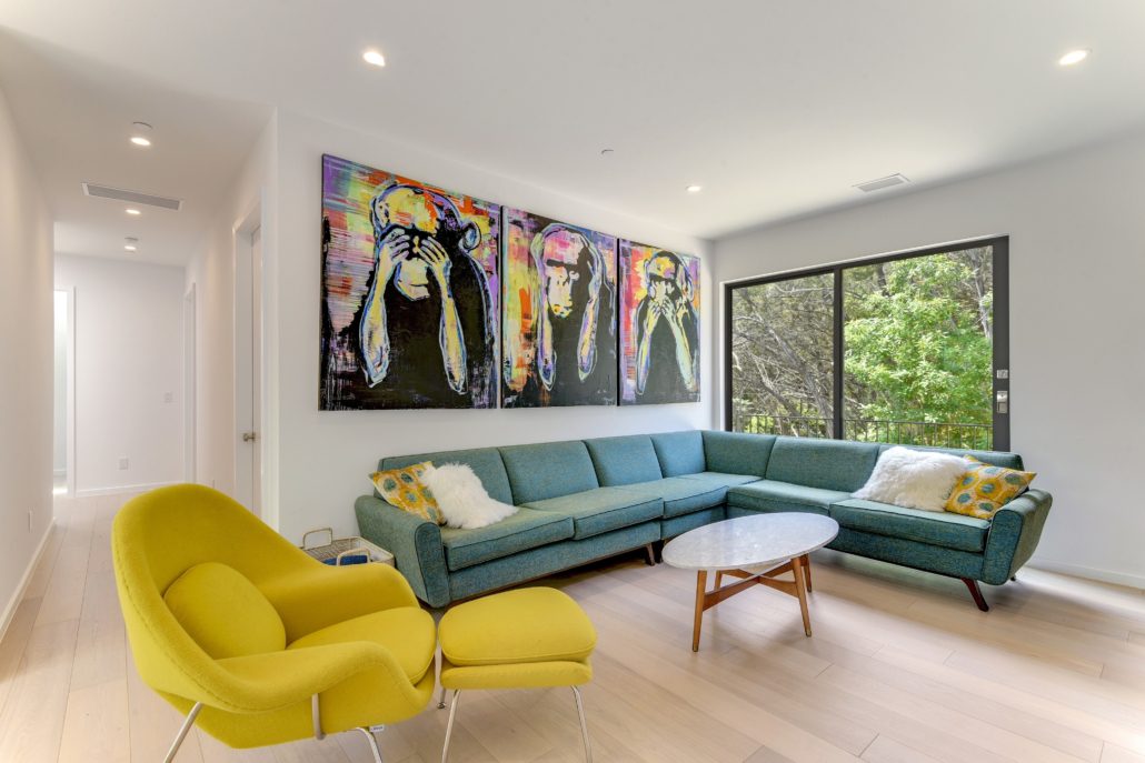
Those clever folks at Pantone have developed four different color palettes to show us the way – Balancing Act, Wellspring, The Star of the Show, and Amusements. From beige or blue, to yellow-orange or even green – some are daring, others are subtle, but they all work beautifully with this year’s new color.
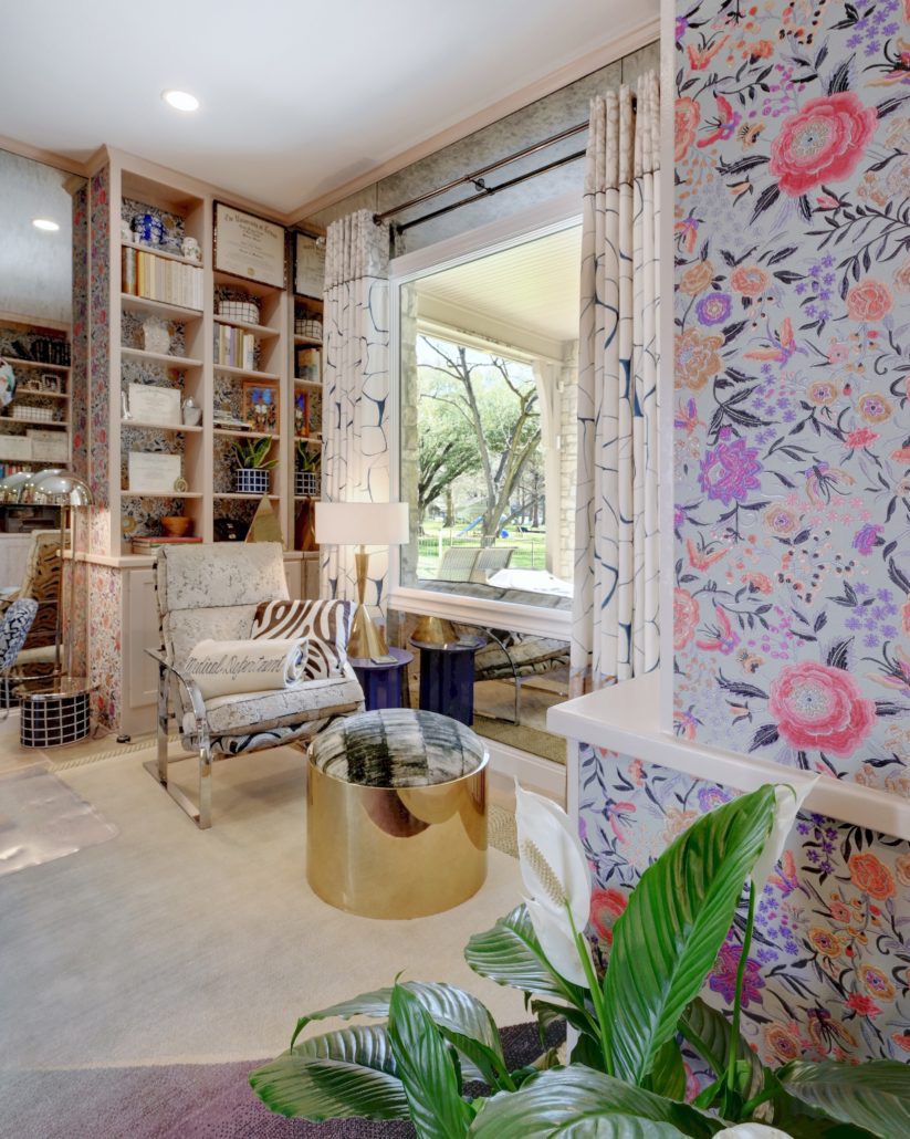
The go-to steps of incorporating new colors are accessories and accent walls, with lots of Pinterest boards and inspirational websites to offer some more in-depth design ideas.

Let’s work together in 2022
We’ve got an eye for beauty, and our eyes are trained on your home next. Let’s elevate your listing and maximize the sale of your home. Let’s talk about virtual staging, virtual tours, floor plans, 3D spaces, videography, and aerial services.
Get in touch to talk about what our motivated and passionate team can do for you.


